- components
- ›
- popover
- ›
- svelte
Popover
A component that displays content in a floating panel, triggered by user interaction.
Example
This is a basic example of a popover.
Arrow
You may optionally enable arrows via the Arrow and ArrowTip component parts. Note that Zag.js opts to style these with CSS custom properties, which can be adjusted using a style attribute.
This example will have a small arrow.
Z-Index
By default we do not take an opinionated stance regarding z-index stacking. The result is the component can sometimes be occluded beneath other elements with a higher index. The Z-Index can controlled by applying a utility class to the Positioner component part.
NOTE: This will need to be forced using
!for!importantto override the Zag.js defaults.
This example will be below the sibling.
This example will be above the sibling.
Sibling (10)
Programmatic Control
This is made possible via the Provider Pattern.
This popover will appear, stay open for three seconds, then close on it's own.
Direction
Example
This is a basic example of a popover.
Headless
Unlike most components in Skeleton, this feature is provided “headless”. This means no default styles are applied out of the box. This ensures you retain full control of all styling.
Hello Skeleton
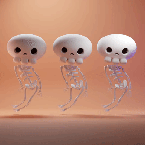
Three spooky skeletons!
The benefits are as follows:
- You can make the
Triggersurround any element, including an icon, button, image, etc. - You can modify the entire structure within
Content, including custom markup and styling. - You may place the
CloseTriggeranywhere, and use it as an X close option.
API Reference
Root
| Property | Default | Type |
|---|---|---|
dir | "ltr" | "ltr" | "rtl" | undefinedThe document's text/writing direction. |
ids | - | Partial<{ anchor: string; trigger: string; content: string; title: string; description: string; closeTrigger: string; positioner: string; arrow: string; }> | undefined The ids of the elements in the popover. Useful for composition. |
modal | false | boolean | undefinedWhether the popover should be modal. When set to `true`: - interaction with outside elements will be disabled - only popover content will be visible to screen readers - scrolling is blocked - focus is trapped within the popover |
portalled | true | boolean | undefinedWhether the popover is portalled. This will proxy the tabbing behavior regardless of the DOM position of the popover content. |
autoFocus | true | boolean | undefinedWhether to automatically set focus on the first focusable content within the popover when opened. |
initialFocusEl | - | (() => HTMLElement | null) | undefinedThe element to focus on when the popover is opened. |
closeOnInteractOutside | true | boolean | undefinedWhether to close the popover when the user clicks outside of the popover. |
closeOnEscape | true | boolean | undefinedWhether to close the popover when the escape key is pressed. |
onOpenChange | - | ((details: OpenChangeDetails) => void) | undefinedFunction invoked when the popover opens or closes |
positioning | - | PositioningOptions | undefinedThe user provided options used to position the popover content |
open | - | boolean | undefinedThe controlled open state of the popover |
defaultOpen | - | boolean | undefinedThe initial open state of the popover when rendered. Use when you don't need to control the open state of the popover. |
getRootNode | - | (() => Node | ShadowRoot | Document) | undefinedA root node to correctly resolve document in custom environments. E.x.: Iframes, Electron. |
onEscapeKeyDown | - | ((event: KeyboardEvent) => void) | undefinedFunction called when the escape key is pressed |
onRequestDismiss | - | ((event: LayerDismissEvent) => void) | undefinedFunction called when this layer is closed due to a parent layer being closed |
onPointerDownOutside | - | ((event: PointerDownOutsideEvent) => void) | undefinedFunction called when the pointer is pressed down outside the component |
onFocusOutside | - | ((event: FocusOutsideEvent) => void) | undefinedFunction called when the focus is moved outside the component |
onInteractOutside | - | ((event: InteractOutsideEvent) => void) | undefinedFunction called when an interaction happens outside the component |
persistentElements | - | (() => Element | null)[] | undefinedReturns the persistent elements that: - should not have pointer-events disabled - should not trigger the dismiss event |
children | - | Snippet<[]> | undefinedThe default slot content to be rendered within the component. |
RootProvider
| Property | Default | Type |
|---|---|---|
value | - | () => PopoverApi<PropTypes> |
children | - | Snippet<[]> | undefinedThe default slot content to be rendered within the component. |
RootContext
| Property | Default | Type |
|---|---|---|
children | - | Snippet<[() => PopoverApi<PropTypes>]> |
Trigger
| Property | Default | Type |
|---|---|---|
element | - | Snippet<[HTMLAttributes<"button">]> | undefinedRender the element yourself |
Positioner
| Property | Default | Type |
|---|---|---|
element | - | Snippet<[HTMLAttributes<"div">]> | undefinedRender the element yourself |
Content
| Property | Default | Type |
|---|---|---|
element | - | Snippet<[HTMLAttributes<"div">]> | undefinedRender the element yourself |
Arrow
| Property | Default | Type |
|---|---|---|
element | - | Snippet<[HTMLAttributes<"div">]> | undefinedRender the element yourself |
ArrowTip
| Property | Default | Type |
|---|---|---|
element | - | Snippet<[HTMLAttributes<"div">]> | undefinedRender the element yourself |
Title
| Property | Default | Type |
|---|---|---|
element | - | Snippet<[HTMLAttributes<"div">]> | undefinedRender the element yourself |
Description
| Property | Default | Type |
|---|---|---|
element | - | Snippet<[HTMLAttributes<"div">]> | undefinedRender the element yourself |
CloseTrigger
| Property | Default | Type |
|---|---|---|
element | - | Snippet<[HTMLAttributes<"button">]> | undefinedRender the element yourself |